1. Introduction
This section is not normative.
1.1. Overview
This is a proposal to add CSS features for decorating gaps. (Some use cases and background discussion can be found in issue #2748.) We propose to extend the column-rule-width property with new values. Add properties to support images and gradients. Add properties for aligning the rule to specific anchor points, specifying its extent area, and to control its position and length within that area. We add support for row rules by adding the corresponding row-* properties. We also widen the scope of these properties so that they can be used in flex containers, grid containers, table and table-row-group containers, as well as multi-column containers.
1.2. Module Interactions
This module extends the definition of the column-rule-width property, adding <percentage> and auto values. We also generalize the existing column-rule-* properties to apply to other types of containers. Accordingly, we propose to move the existing column-rule properties from the Multi-column spec to the Box Alignment spec. Additionally, all new properties and shorthands in this proposal are intended as additions to the Box Alignment spec.
1.3. Definitions
In this specification, we will use the term lateral axis to refer to the axis in which the rule’s thickness grows (i.e. the axis column-rule-width use). The other axis is the rule’s longitudinal axis and its size in this axis is the rule length. These definitions are relative to the rule itself and does not depend on if the rule is a row or column rule, or what the writing-mode is.
2. Rule Images and Gradients
Authors may specify an image or gradient to be used in place of the column-rule-style. These properties are loosely modeled after the corresponding border-image-* properties. Rules are one-dimensional though, as opposed to borders which have four sides around an area. A rule is like a border with just one side rendered with the other sides having border-style: none.
2.1. The column-rule-image-source and row-rule-image-source Properties
| Name: | column-rule-image-source, row-rule-image-source |
|---|---|
| Value: | none | <image> |
| Initial: | none |
| Applies to: | multi-column containers, flex containers, grid containers, table and table-row-group containers |
| Inherited: | no |
| Percentages: | N/A |
| Computed value: | the keyword none or the computed <image> |
| Canonical order: | per grammar |
| Animation type: | discrete |
These properties specify an <image> to use in place of the rendering specified by the column-rule-style/row-rule-style properties.
As for borders, a rule image is not rendered when the corresponding column-rule-style/row-rule-style is none.
2.2. The column-rule-image-slice and row-rule-image-slice Properties
| Name: | column-rule-image-slice, row-rule-image-slice |
|---|---|
| Value: | [<number [0,∞]> | <percentage [0,∞]>]{1,2} |
| Initial: | 0 |
| Applies to: | multi-column containers, flex containers, grid containers, table and table-row-group containers |
| Inherited: | no |
| Percentages: | refer to image size in the rule’s longitudinal axis |
| Computed value: | one or two values, each either a number or percentage |
| Canonical order: | per grammar |
| Animation type: | discrete |
column-rule-image-slice specify inward offsets from the start and end edges of the image in the rule’s longitudinal axis, dividing it into three regions: two edge areas and one middle area.
When two values are specified, they set the offsets on the start and end sides in that order. If the end value is missing, it is the same as the start value.
- <percentage [0,∞]>
- Percentages are relative to the image size in the rule’s longitudinal axis
- <number [0,∞]>
- Numbers represent pixels in the image (if the image is a raster image) or vector coordinates (if the image is a vector image).
Negative values are not allowed. Computed values larger than the size of the image are interpreted as 100%.
If the image must be sized to determine the slices (for example, for SVG images with no intrinsic size), then it is sized using the CSS Images 3 § 4.3.1 Default Sizing Algorithm with no specified size and the rule containing rectangle as the default object size.
The regions given by the column-rule-image-slice values may overlap. However if the sum of the start and end values is equal to or greater than the size of the image, the middle part becomes empty.
2.3. The column-rule-image-repeat and row-rule-image-repeat Properties
| Name: | column-rule-image-repeat, row-rule-image-repeat |
|---|---|
| Value: | stretch | repeat | round | space |
| Initial: | stretch |
| Applies to: | multi-column containers, flex containers, grid containers, table and table-row-group containers |
| Inherited: | no |
| Percentages: | N/A |
| Computed value: | the specified keyword |
| Canonical order: | per grammar |
| Animation type: | discrete |
These properties specify how the middle part of a sliced rule image is scaled and tiled. Values have the following meanings:
- stretch
- The image is stretched to fill the area.
- repeat
- The image is tiled (repeated) to fill the area.
- round
- The image is tiled (repeated) to fill the area. If it does not fill the area with a whole number of tiles, the image is rescaled so that it does.
- space
- The image is tiled (repeated) to fill the area. If it does not fill the area with a whole number of tiles, the extra space is distributed around the tiles.
The exact process for scaling and tiling the image parts is defined by drawing the equivalent border-image with the top and bottom border-image-slice values set from the corresponding column-rule-image-slice values, and the border-image-slice left value set to 100% and the right value set to 0. The border-image-width top value set to the column-rule-image-slice top value. The border-image-width top value set to the column-rule-image-slice bottom value. The border-image-width top value set to zero.
2.4. The column-rule-image and row-rule-image Shorthands
| Name: | column-rule-image, row-rule-image |
|---|---|
| Value: | <'column-rule-image-source'> || <'column-rule-image-slice'> || <'column-rule-image-repeat'> |
| Initial: | see individual properties |
| Applies to: | multi-column containers, flex containers, grid containers, table and table-row-group containers |
| Inherited: | see individual properties |
| Percentages: | see individual properties |
| Computed value: | see individual properties |
| Animation type: | see individual properties |
| Canonical order: | per grammar |
3. Rule Positioning and Sizing
3.1. The column-rule-width and row-rule-width Properties
| Name: | column-rule-width |
|---|---|
| New values: | <percentage> | auto |
| Initial: | medium |
| Applies to: | multi-column containers, flex containers, grid containers, table and table-row-group containers |
| Inherited: | no |
| Percentages: | refer to the rule containing rectangle’s size in the rule’s lateral axis |
| Computed value: | absolute length if the specified value is <line-width>; 0px if the column rule style is none or hidden. Otherwise, the specified value. |
| Animation type: | by computed value type |
| Name: | row-rule-width |
|---|---|
| Value: | <line-width> | <percentage> | auto |
| Initial: | medium |
| Applies to: | multi-column containers, flex containers, grid containers, table and table-row-group containers |
| Inherited: | no |
| Percentages: | refer to the rule containing rectangle’s size in the rule’s lateral axis |
| Computed value: | absolute length if the specified value is <line-width>; 0px if the column rule style is none or hidden. Otherwise, the specified value. |
| Canonical order: | per grammar |
| Animation type: | by computed value type |
These properties sets the thickness (lateral size) of a rule in the column and row axis, respectively. Negative specified values are not allowed. The used value is floored at zero (in case a 'calc()' expression evaluates to a negative value for example).
See § 3.4 Resolving a rule’s position and size below for how auto is resolved.
3.2. The column-rule-length and row-rule-length Properties
| Name: | column-rule-length, row-rule-length |
|---|---|
| Value: | <length-percentage> | auto |
| Initial: | auto |
| Applies to: | multi-column containers, flex containers, grid containers, table and table-row-group containers |
| Inherited: | no |
| Percentages: | refer to the rule containing rectangle’s size in the rule’s longitudinal axis |
| Computed value: | the specified value |
| Canonical order: | per grammar |
| Animation type: | by computed value type |
These properties sets the rule length (longitudinal size) of a rule in the column and row axis, respectively. Negative specified values are not allowed. The used value is floored at zero (in case a 'calc()' expression evaluates to a negative value for example).
See § 3.4 Resolving a rule’s position and size below for how auto is resolved.
Note: These properties work the same as the *-rule-width properties in the lateral axis, except that they have a different initial value.
3.3. The Rule Lateral Inset Properties
| Name: | column-rule-lateral-inset-start, column-rule-lateral-inset-end, row-rule-lateral-inset-start, row-rule-lateral-inset-end |
|---|---|
| Value: | <length-percentage> | auto |
| Initial: | auto |
| Applies to: | multi-column containers, flex containers, grid containers, table and table-row-group containers |
| Inherited: | no |
| Percentages: | refer to the rule containing rectangle’s size in the rule’s lateral axis |
| Computed value: | the specified value |
| Canonical order: | per grammar |
| Animation type: | by computed value type |
These properties sets the lateral start/end offset of the rule in the column and row axis, respectively. A positive value moves the position inward and a negative value outward from the corresponding rule containing rectangle’s edge.
NOTE: The column-rule-lateral-inset and column-rule-width used values are calculated in a similar way to how left/right and width are calculated for an absolutely positioned box. The precise algorithm is described next.
3.4. Resolving a rule’s position and size
Given a triplet of values: inset-start/end and a size for an axis, auto values are resolved so that the sum of the three values equals the rule containing rectangle size in the same axis. These are the rules for resolving them:
- if all the values are auto then set both inset values to zero and solve for size
- if none of the values are auto then the situation is over-constrained: solve by treating the end inset value as auto
- if both inset properties are auto, but the size is not, then solve with the additional constraint that the inset values must have equal values (resulting in the rule being centered)
- if the size is auto and only one of the inset values is auto then set the auto inset value to zero and solve for size, if that makes size negative then set the size to zero and solve for the auto inset value instead (i.e. the rule is sized to fill the remaining space, until it becomes zero in which case its positioned at the non-auto inset edge)
- if the size is auto and both inset values are non-auto then solve for size, if that makes the size negative then set the size to zero and solve again by treating the end inset value as auto
These rules resolves the column-rule-width, column-rule-lateral-inset-start, and column-rule-lateral-inset-end triplet of values in a rule’s lateral axis.
The same rules are also used to resolve column-rule-length, column-rule-longitudinal-[edge-]inset-start, and column-rule-longitudinal-[edge-]inset-end triplet of values in a rule’s longitudinal axis (see the longitudinal property descriptions below for which of the "edge" or non-"edge" values is used).
Ditto for the corresponding row-rule-* properties.
3.5. The column-rule-lateral-inset and row-rule-lateral-inset Shorthands
| Name: | column-rule-lateral-inset |
|---|---|
| Value: | <'column-rule-lateral-inset-start'> <'column-rule-lateral-inset-end'>? |
| Initial: | see individual properties |
| Applies to: | see individual properties |
| Inherited: | see individual properties |
| Percentages: | see individual properties |
| Computed value: | see individual properties |
| Animation type: | see individual properties |
| Canonical order: | per grammar |
| Name: | row-rule-lateral-inset |
|---|---|
| Value: | <'row-rule-lateral-inset-start'> <'row-rule-lateral-inset-end'>? |
| Initial: | see individual properties |
| Applies to: | see individual properties |
| Inherited: | see individual properties |
| Percentages: | see individual properties |
| Computed value: | see individual properties |
| Animation type: | see individual properties |
| Canonical order: | per grammar |
These are shortands for specifying the corresponding start/end values. If one value is specified it is used for both start and end.
3.6. The Rule Longitudinal Inset Properties
| Name: | column-rule-longitudinal-inset-start, column-rule-longitudinal-inset-end, row-rule-longitudinal-inset-start, row-rule-longitudinal-inset-end |
|---|---|
| Value: | <length-percentage> | auto |
| Initial: | 0 |
| Applies to: | multi-column containers, flex containers, grid containers, table and table-row-group containers |
| Inherited: | no |
| Percentages: | refer to the rule containing rectangle’s size in the rule’s longitudinal axis |
| Computed value: | the specified value |
| Canonical order: | per grammar |
| Animation type: | by computed value type |
These properties sets the longitudinal start/end inset of the rule in the column and row axis, respectively. They are only used on a rule’s edges that are interior. The *-rule-longitudinal-edge-inset properties are used for rule edges that are on the outer edges of an axis. The used values are calculated the same as for the lateral properties above.
Note: These have a different initial value than the lateral inset properties, meaning the rule will stretch to fill the rule containing rectangle in this axis. The initial values as specified above are backward compatible with how column rules are sized and positioned in legacy multi-column layout.
3.7. The column-rule-longitudinal-inset and row-rule-longitudinal-inset Shorthands
| Name: | column-rule-longitudinal-inset |
|---|---|
| Value: | <'column-rule-longitudinal-inset-start'> <'column-rule-longitudinal-inset-end'>? |
| Initial: | see individual properties |
| Applies to: | see individual properties |
| Inherited: | see individual properties |
| Percentages: | see individual properties |
| Computed value: | see individual properties |
| Animation type: | see individual properties |
| Canonical order: | per grammar |
| Name: | row-rule-longitudinal-inset |
|---|---|
| Value: | <'row-rule-longitudinal-inset-start'> <'row-rule-longitudinal-inset-end'>? |
| Initial: | see individual properties |
| Applies to: | see individual properties |
| Inherited: | see individual properties |
| Percentages: | see individual properties |
| Computed value: | see individual properties |
| Animation type: | see individual properties |
| Canonical order: | per grammar |
These shortands specify the corresponding start/end values. If one value is specified it is used for both start/end.
3.8. The Rule Longitudinal Edge Inset Properties
| Name: | column-rule-longitudinal-edge-inset-start, column-rule-longitudinal-edge-inset-end, row-rule-longitudinal-edge-inset-start, row-rule-longitudinal-edge-inset-end |
|---|---|
| Value: | <length-percentage> | auto |
| Initial: | 0 |
| Applies to: | multi-column containers, flex containers, grid containers, table and table-row-group containers |
| Inherited: | no |
| Percentages: | refer to the rule containing rectangle’s size in the rule’s longitudinal axis |
| Computed value: | the specified value |
| Canonical order: | per grammar |
| Animation type: | by computed value type |
These properties are identical to their non-"edge" counter-parts. These properties are used on the start edge of the first rule that on the container’s start edge in its longitudinal axis, and the end edge of the last rule at the end of the container. For interior rule edges, the non-"edge" properties are used. In other words, these properties are used together with the *-rule-edge-align properties (defined below) and the *-rule-longitudinal-inset properties are used together with *-rule-align.
3.9. The column-rule-longitudinal-edge-inset and row-rule-longitudinal-edge-inset Shorthands
| Name: | column-rule-longitudinal-edge-inset |
|---|---|
| Value: | <'column-rule-longitudinal-edge-inset-start'> <'column-rule-longitudinal-edge-inset-end'>? |
| Initial: | see individual properties |
| Applies to: | see individual properties |
| Inherited: | see individual properties |
| Percentages: | see individual properties |
| Computed value: | see individual properties |
| Animation type: | see individual properties |
| Canonical order: | per grammar |
| Name: | row-rule-longitudinal-edge-inset |
|---|---|
| Value: | <'row-rule-longitudinal-edge-inset-start'> <'row-rule-longitudinal-edge-inset-end'>? |
| Initial: | see individual properties |
| Applies to: | see individual properties |
| Inherited: | see individual properties |
| Percentages: | see individual properties |
| Computed value: | see individual properties |
| Animation type: | see individual properties |
| Canonical order: | per grammar |
These shortands specify the corresponding start/end values. If one value is specified it is used for both start/end.
4. Row Rule Style and Color
4.1. The row-rule-style and row-rule-color Properties
| Name: | row-rule-style |
|---|---|
| Value: | <line-style> |
| Initial: | none |
| Applies to: | multi-column containers, flex containers, grid containers, table and table-row-group containers |
| Inherited: | no |
| Percentages: | N/A |
| Computed value: | specified keyword |
| Canonical order: | per grammar |
| Animation type: | discrete |
| Name: | row-rule-color |
|---|---|
| Value: | <color> |
| Initial: | currentcolor |
| Applies to: | multi-column containers, flex containers, grid containers, table and table-row-group containers |
| Inherited: | no |
| Percentages: | N/A |
| Computed value: | computed color |
| Canonical order: | per grammar |
| Animation type: | by computed value type |
These properties are the same as the column- properties but for the row rules.
4.2. The row-rule Shorthand
This shorthand works the same as column-rule.
| Name: | row-rule |
|---|---|
| Value: | <'row-rule-width'> || <'row-rule-style'> || <'row-rule-color'> |
| Initial: | see individual properties |
| Applies to: | see individual properties |
| Inherited: | see individual properties |
| Percentages: | see individual properties |
| Computed value: | see individual properties |
| Animation type: | see individual properties |
| Canonical order: | per grammar |
lots of new possible shorthands... we now have many properties (and shorthands) with a column-rule and row-rule prefix. Should we add shorthands for some of those with a rule prefix to specify both axes, like so: 'rule-foo: <row-rule-foo> <column-rule-foo>?'. As usual, we have to be careful with the separator though, to make it forward-compatible with any changes we might want to make...
5. Rule Alignment
5.1. The column-rule-align and row-rule-align Properties
| Name: | column-rule-align, row-rule-align |
|---|---|
| Value: | [gap | gap-center | gap-over | rule | rule-center | rule-over]{1,2} |
| Initial: | gap |
| Applies to: | multi-column containers, flex containers, grid containers, table and table-row-group containers |
| Inherited: | no |
| Percentages: | N/A |
| Computed value: | the specified value |
| Canonical order: | per grammar |
| Animation type: | discrete |
These properties specify the start/end attachment point of the rule containing rectangle in the longitudinal axis. The start value is specified first, the end value second. If only one value is specified it is used for both start and end. These properties are only used for interior edges. The *-rule-edge-align properties described below specify the alignment on the outer edges. The initial value, gap, means that, by default, a rule will stretch its longitudinal size to fill the space from the end of the gap "above" to the start of the gap "below" ("above" meaning the gap in the orthogonal axis on the rule’s start side).
5.2. The column-rule-edge-align and row-rule-edge-align Properties
| Name: | column-rule-edge-align, row-rule-edge-align |
|---|---|
| Value: | [gap | gap-center | gap-over]{1,2} |
| Initial: | gap |
| Applies to: | multi-column containers, flex containers, grid containers, table and table-row-group containers |
| Inherited: | no |
| Percentages: | N/A |
| Computed value: | the specified value |
| Canonical order: | per grammar |
| Animation type: | discrete |
These properties specify the start/end attachment point of the rule containing rectangle in the longitudinal axis for the outer edges only. That is, the start edge of the first rule and the end edge of the last rule (which may be the same rule). The start value is specified first, the end value second. If only one value is specified it is used for both start and end. (Attachment points for the interior rule edges are specified with the *-rule-align properties above.)
Note: The rule/rule-center/rule-over keywords are omitted here (compared with column-rule-align) since there are no rules in the edge gutters.
The figure below illustrates the alignment values. The red values are used for the top column rule’s start edge and the yellow values are used for its end edge. The yellow values are also used for the bottom column rule’s start edge. However, in this case the roles of gap / gap-over and rule / rule-over are swapped. It’s only the center values that are shared. Also note that gap-center isn’t necessarily aligned with rule-center. In this case they aren’t aligned because the row rule (purple) is using a lateral start inset. The cyan colored values are used for the bottom column border’s end edge. (If the top border were to stretch over the entire grid, then they would be used for its end edge.)
column-rule-edge-align controls which of the red and cyan colored attachment points should be used. column-rule-edge-align the yellow colored ones (and all other interior edges if there were more rows).
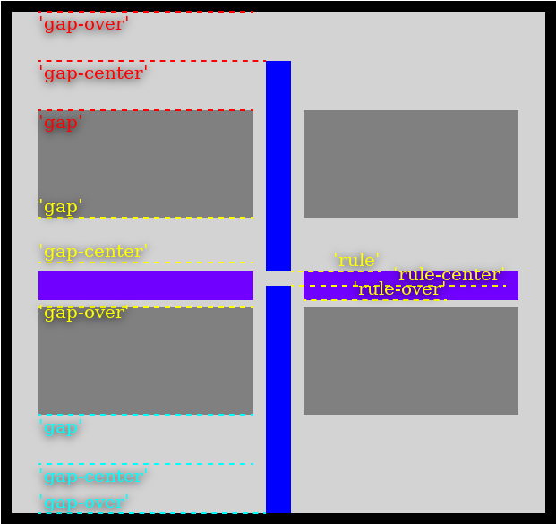
Here’s the rule styling used for the above example:
column-rule : 14 px solid blue; column-rule-align : rule-center rule; column-rule-edge-align : gap-center gap-over; row-rule : 16 px solid #7000ff; row-rule-lateral-inset-start : 30 px ;
The alignment points follow the same pattern in the other axis for the row rules. In this case the row rule is using the initial values (gap) so they align with the inline axis gap edges.
Are there use cases for other box-related edge attachment points? e.g. 'padding | padding-center | padding-over | border...'
6. Rule Extent
6.1. The column-rule-extent and row-rule-extent Properties
| Name: | column-rule-extent, row-rule-extent |
|---|---|
| Value: | [segment | start | end | short | long | all-start | all-end | all-short | all-long ] allow-overlap? |
| Initial: | long |
| Applies to: | multi-column containers, flex containers, grid containers, table and table-row-group containers |
| Inherited: | no |
| Percentages: | N/A |
| Computed value: | the specified value |
| Canonical order: | per grammar |
| Animation type: | discrete |
perhaps make all a separate keyword? like so: [segment | [[start | end | short | long] all?] ] allow-overlap?
These properties specify the extent of the rule in its longitudinal axis. segment is an abstract term to describe the distance between two consecutive gaps. An extent can cover one or more segments and the extent size is the distance between the start position of the first of those segments and the end position of the last segment. We’ll define segment in more detail in the container-specific sub-sections that follow.
The allow-overlap only affects rules in grid and table layout with spanning items/cells. It controls whether a rule should continue through such a span.
Note: It’s only an item’s grid span that are considered when determining if an item is spanning or not, not its layout position or size.
The all-* values makes a rule extend over all segments in an axis, subject to not being interrupted by a span. In grid and table layout, where the tracks/table groups/rows all have the same length in a rule’s longitudinal axis, all the all-* have the same behavior. They are intended for flexbox and masonry layout, where the gaps may fall at different positions in adjacent flex lines and masonry tracks.
The lateral position of a rule is determined by its first segment.
The following sub-sections will describe the rule extent for each type of layout container in more detail.
6.1.1. Grid Containers
In a grid container, gaps are placed between tracks, so the segment value maps to the extent of a grid cell.
This example illustrates segment rules. Note that rules are generated in all gaps, whether there are items in a grid cell or not.
Collapsed tracks don’t count -- they don’t generate gaps and thus don’t have gap rules. They generally behave as if they don’t exist as far as rules are concerned. The example below also illustrates that the position and size of the items don’t affect the rules; it’s only the position and size of the grid cells that count.
Rules behave symmetrically in the grid axes, but a masonry axis in a masonry grid layout behaves differently; we’ll cover that case in a separate section later.
In a grid axis, rules are created between adjacent (non-collapsed) tracks and their extent sizes are controlled by the column-rule-extent/row-rule-extent values as follows:
- segment
- the extent size is the size of grid cell in the relevant axis
- start
- the extent size is the size of the next grid cell span in the start-most of the two adjacent tracks
- end
- the extent size is the size of the next grid cell span in the end-most of the two adjacent tracks
- short
- the extent size is the smaller of the next grid cell span sizes of the two adjacent tracks
- long
- the extent size is the larger of the next grid cell span sizes of the two adjacent tracks
- all-start, all-end, all-short, all-long
- the extent size is the length of the track in the relevant axis (they all behave the same because all tracks in a grid axis have the same size)
- allow-overlap
- controls whether the next grid cell span stops short of a cell which has an item spanning over the gap (see the algorithm below)
The following algorithm determines the rule segments to create in an axis and their extent sizes. For each pair of adjacent tracks, we first find the next grid cell span for each track. Then select one of those per the property values above.
For each pair of adjacent tracks, start by setting each track’s current cell to be its first cell in the implicit grid, then:
- if allow-overlap was not specified, and the current cell in the start-most of the pair of tracks contains an item that spans into the end-most of the tracks, then skip this cell and let the current cell of each track be the cell after it, then go to step 1 or exit if there are no more cells
- if the *-rule-extent is one of the all-* values, then the next grid cell span is the span of cells from the current cell to last cell in the track (inclusive); if allow-overlap was not specified, then stop before the first (opposite axis) track that contains an item spanning between this pair of tracks
- otherwise, if the current cell is empty, or *-rule-extent is segment, then the next grid cell span of that track is the current cell
- otherwise, if the current cell contains items that are spanning in the same axis, then that track’s next grid cell span is the longest of those spans; if allow-overlap was not specified, then stop before the first (opposite axis) track that contains an item spanning between this pair of tracks
-
create a rule segment with the following extent size:
- for short(long), the extent size is the length of the shortest(longest) of the two next grid cell spans
- for start(end), the extent size is the length of the next grid cell span of the start-most(end-most) track
- for all-*, the extent size is the length of the next grid cell span (which is always the same for the two tracks)
- set the current cell to the next cell, in each track, that is after the last cell of the next grid cell span that we picked in the steps above; exit if there are no more cells; otherwise, go to step 1.
6.1.1.1. Subgrid
A subgrid creates its own set of gap rules. It uses its own gaps, which are centered with, but may have a different size than the ancestor grid(s), as described in subgrids. Other than that, rules are created inside a subgrid in the same way as in a regular grid.
A grid item that is a subgrid affects its parent grid’s rule formation exactly as a regular non-subgrid item would (whether the parent is also a subgrid or not), i.e. its span (if any) affects the algorithm above in the same way.
allow-overlap can be used in the parent to extend its rules under the subgrid. The subgrid’s rules, if any, are rendered by the subgrid and thus render on top of the parent, as usual.
When the subgrid determines its rule extents, it does not consider any items that aren’t its own grid items, i.e. any items in an ancestor grid that have been placed into the same grid cell that the subgrid occupies are not considered. Furthermore, it only uses its own local gap and rule metrics for positioning and sizing its rules. It doesn’t consider any gaps or rules that originate outside of the subgrid.
6.1.1.2. Masonry
Masonry layout has one grid axis (which may be subgridded) and one masonry axis. The grid axis works the same as has been described above. The masonry axis is special since an item is placed into a grid track based on the layout size of the items before it, so they are typically not aligned over the tracks. Furthermore, the grid tracks may have a different start position (due to masonry axis alignment) and size.
TODO: add definition list and algorithm here...
is it useful to be able to create a rule extent for the intersection or union between two tracks, like so: 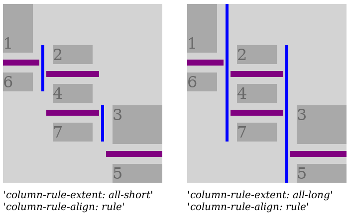 It’s pretty easy to implement, fwiw... (I accidently implemented short/long like that before I realized it was inconsistent with how they work elsewhere). I think it’s a case that is unique to a masonry axis though, at least currently...
6.1.2. Flex Containers
In a row-oriented flex container, the row-rule-* properties creates rules between flex lines, and the column-rule-* properties creates rules between flex items within a flex line.
In column-oriented flex container, the roles of row-rule-extent and column-rule-extent are swapped. For the rest of this sub-section we will describe the row-oriented case (just swap column/row in the text below to get the column-oriented case).
Flex items can’t span multiple lines so there are no collisions possible for the main axis rules, hence the allow-overlap keyword is ignored in flex layout in the main axis. A subsequent flex line is considered as a collision for the cross axis rules, i.e. a cross axis rule has the extent of one flex line, unless allow-overlap is used (together with one the all-* values). The reason is that items in different lines typically don’t line up in a way that the gaps between items are aligned across the lines (unless an author is very careful to arrange that), so this is to have a safe default behavior.
all-long allow-overlap can be used to override that and the extent size is then from the cross axis start edge of the first flex line to the cross axis end edge of the last flex line (all the all-* behave the same). Only the first flex line creates column rules in this case, and the rule’s lateral position is taken from the gap in the first line.
Authors are advised to not use the allow-overlap value in the main axis of a multi-line flex container since it’s likely to make items on subsequent lines overlap the rules. It may be used when all flex items are guaranteed to have the exact same main axis outer size and align such that the gaps are aligned between all the lines.
Rules are created between adjacent flex lines, and their extent sizes are controlled by the row-rule-extent values defined as follows:
- segment
- behaves as short
- start
- use the outer size of the items in the flex line on the block axis start side
- end
- use the outer size of the items in the flex line on the block axis end side
- short
- use the outer size of the next flex line item which has the smaller size (see detailed algorithm below)
- long
- use the outer size of the next flex line item which has the larger size (see detailed algorithm below)
- all-start
- the distance between the start position of the first item to the end position of the last item on the start side flex line
- all-end
- the distance between the start position of the first item to the end position of the last item on the end side flex line
- all-short
- the distance between the end-most start position of the first item on each flex line to the start-most end position of the last item on each flex line
- all-long
- the distance between the start-most start position of the first item on each flex line to the end-most end position of the last item on each flex line
- allow-overlap
- is ignored in this axis since flex items can’t span between flex lines so there are no collisions (as defined in this spec)
The next flex line item is assigned by the following algorithm. For each pair of adjacent flex lines, start with assigning the next flex line item to the first item (in order-modified document order) on the respective line, then:
- exit if neither line has a next flex line item
-
- if only one line has a next flex line item then pick that item and go to 2
- if either of the two next flex line items has a start position that is beyond the other item’s end position, then pick the start-most item and go to 2.
- otherwise, pick the item with the smallest(largest) outer size for short(long)
- use the picked item’s outer size as this rule segment’s extent size, then change the next flex line item for the picked item’s line to the next item on its line
- assign the next flex line item for the other line to the next item on this line that has an inline start position that is greater than the end position of the picked item
(start/end position and sizes above are referring to the item’s margin-box in the rule’s longitudinal axis; the phrase "next item" refers to the next item in order-modified document order)
6.1.3. Table Containers
A table container creates rules between its table-column-groups and table-row-groups. Collapsed column-groups and row-groups are treated as if they don’t exist. Column rules (between table-column-groups) collide with table-row-groups. Row rules (between table-row-groups) collide with table-column-groups. The allow-overlap can be used to create rules that extend over the entire column/row length. Given that all table-column-groups have the same block axis size and all table-row-groups have same the inline axis size, the short/long/start/end keywords behave the same. Ditto for the all-* keywords.
sort out if non-collapsed column-groups that only contain collapsed columns should generate rules, ditto row-groups/rows
6.1.4. Table Row Group Containers
A table-row-group container creates rules between its table-rows and between each table-cell in a row. Collapsed table-rows are treated as if they don’t exist. Collapsed table-columns are treated as if they don’t exist.
Row rules (between table-rows) collide with cells that have a row span crossing it. Column rules (between table-cells) collide with cells that have a column span crossing it. allow-overlap can be used to create rules that extend over such spanning cells.
visibility:collapse on table-cells does not affect the rules in any way.
6.1.5. Multi-Column Containers
Multi-column containers already support rendering column rules between their columns. That’s now extended with all the new features described above. The changes described above are backwards-compatible with existing web content that use valid column-rule style values. Some previously invalid column-rule values are now valid though, which could cause problems. For example, column-rule-width: 100%, which previously would not parse, will now start doing something.
The row-rule-* properties apply to multi-column containers, and create row rules between multicol lines and spanners, separating them in the block axis.
The segments are the columns and the margin-box of spanners.
this proposal makes the assumption that the related proposal that row-gap should apply to multi-column containers is also adopted (issue #6746).
7. The Rule Containing Rectangle
The rule containing rectangle is formed by the rule extent and alignment in the longitudinal axis, and by the size of the gutter in the lateral axis. (For clarity, the size of the gutter is calculated from the gap properties plus any extra space contributed by alignment distribution but does not include any item margins.)
It is important to note that the rule containing rectangle’s size in an axis isn’t affected by any of the inset properties in the same axis as that would lead to a circular dependency when resolving inset percentage values. (The rule containing rectangle is the percentage basis for all the rule properties which take percentage values.) However, a rule that uses column-rule-align: rule | rule-center | rule-over is affected by the lateral inset properties of the rule it aligns to in the opposite axis.
Here’s an illustration of the rule containing rectangle (the dashed green rectangle) for the top blue rule. This is a 2x2 grid using the default extent, so the extent size is the row’s block size. It has the following non-default rule properties:
column-rule : 14 px solid blue; column-rule-align : rule; column-rule-edge-align : gap-center; column-rule-longitudinal-inset-end : 8 px ; row-rule : 6 px solid black; row-rule-lateral-inset-start : 20 px ;
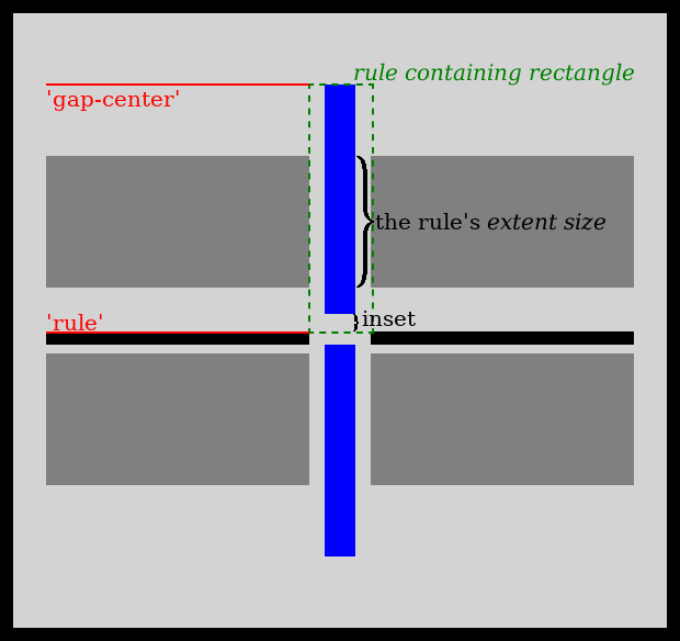
Note that the rule containing rectangle extends to the start of the black horizontal rule, which has a 20px lateral inset (making it non-centered). We align to its start with column-rule-align: rule. From there, we move the bottom edge of the blue rule up by 8px with column-rule-longitudinal-inset-end: 8px. The default column-rule-length: auto then fills the resulting area. If we were to use column-rule-length: 100% here instead, then the rule would fill the rule containing rectangle vertically, since that’s its percentage basis. (The end inset would then be ignored since the start inset is zero by default so the situation is over-constrained, and we resolve by ignoring the end inset, per the sizing rules.)
8. Rule Painting Order
Column and row rules are painted in the same layer as the element’s border. They are painted after (on top of) the element’s border. All column rules for an element are painted first, then all of its row rules. The rules for an axis are painted in the order they were generated by the rule extent algorithms described above. Typically from the logical start to the end of the axis.
For table layout, all the table rules (in both axes) are painted before the rules for the row-groups. The painting order between multiple row-groups is whatever the table spec specifies. For an individual row-group, the rules are painted in logical start to end order in both axes.
Again, note that for a specific fragment, all the column rules are painted before all the row rules, the above merely tries to clarify the painting order of the rules for a specific axis.
9. Rule Overflow
The column and row rule areas contributes to a fragment’s ink overflow. Note that they can overflow an fragment’s border-box due to negative inset values etc.
For clarity, none of the properties in this spec affects layout in any way. Column and row rules are purely a painting effect.